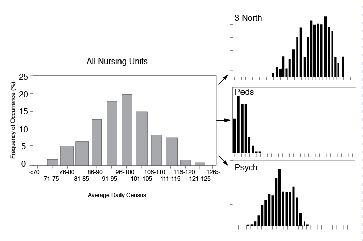
 Histogram
Why use it?
To summarize data from a process that has been collected over a period of time, and graphically present its frequency distribution in bar form.
What does it do?
- Displays large amounts of data that are difficult to interpret in tabular form
- Shows the relative frequency of occurrence of the various data values
- Reveals the centering, variation, and shape of the data
- Illustrates quickly the underlying distribution of the data
- Provides useful information for predicting future performance of the process
- Helps to indicate if there has been a change in the process
- Helps answer the question “Is the process capable of meeting my customer requirements?”
How do I do it?
- Decide on the process measure.
- The data should be variable data (i.e., measured on a continuous scale. For example: temperature, time, dimensions, weight, speed).
- Gather data.
- Collect at least 50 to 100 data points if you plan on looking for patterns and calculating the distribution’s centering (mean), spread (variation), and shape. You might also consider collecting data for a specified period of time: hour, shift, day, week, etc.
- Use historical data to find patterns or to use as a baseline measure of past performance.
- Prepare a frequency table from the data.
a) Count the number of data points, n, in the sample.
Data Points in Sample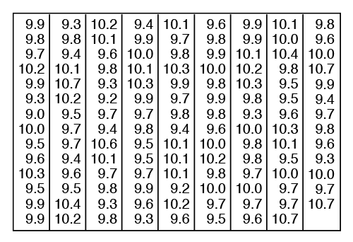
In this example, there are 125 data points (n = 125).
b) Determine the range, R, for the entire sample.
The range is the smallest value in the set of data subtracted from the largest value. For our example:
R = Xmax – Xmin = 10.7 – 9.0 = 1.7
c) Determine the number of class intervals, k, needed.
- Method 1: Take the square root of the total number of data points and round to the nearest whole number.

- Method 2: Use the table below to provide a guideline for dividing your sample into a reasonable number of classes.

- Method 1: Take the square root of the total number of data points and round to the nearest whole number.
For our example, 125 data points would be divided into 7–12 class intervals.
d) Determine the class width, H.
- The formula for this is:

- Round your number to the nearest value with the same decimal numbers as the original sample. In our example, we would round up to .20. It is useful to have intervals defined to one more decimal place than the data collected.
e) Determine the class boundaries, or end points.
- Use the smallest individual measurement in the sample, or round to the next appropriate lowest round number. This will be the lower end point for the first class interval. In our example this would be 9.0.
- Add the class width, H, to the lower end point.This will be the lower end point for the next class interval. For our example:
9.0 + H = 9.0 + .20 = 9.20
Thus, the first class interval would be 9.00 and everything up to, but not including 9.20 (that is, 9.00 through 9.19). The second class interval would begin at 9.20 and be everything up to, but not including 9.40.
- Consecutively add the class width to the lowest class boundary until the k class intervals and/or the range of all the numbers are obtained.
f) Construct the frequency table based on the values you computed in item “e.”
A frequency table based on the data from our example is shown below.
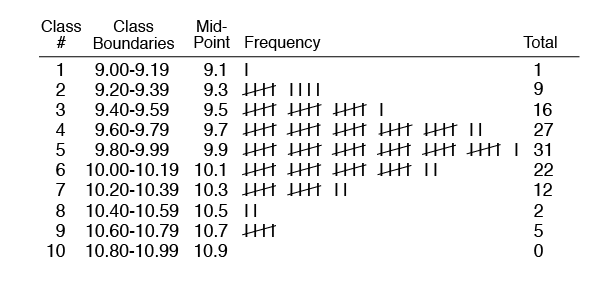
- Draw a Histogram from the frequency table.
- On the vertical line (y axis), draw the frequency (count) scale to cover the class interval with the highest frequency count.
- On the horizontal line (x axis), draw the scale related to the variable you are measuring.
- For each class interval, draw a bar with the height equal to the frequency tally of that class.
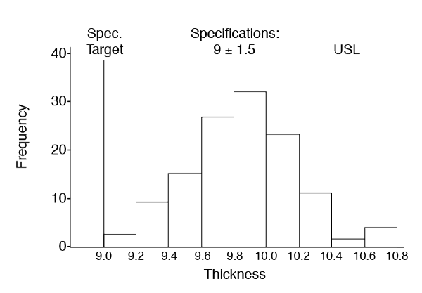
- Interpret the Histogram.
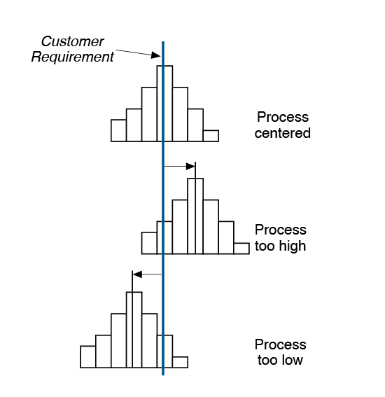
a) Centering. Where is the distribution centered? Is the process running too high? Too low?
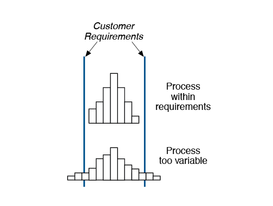
b) Variation. What is the variation or spread of the data? Is it too variable?
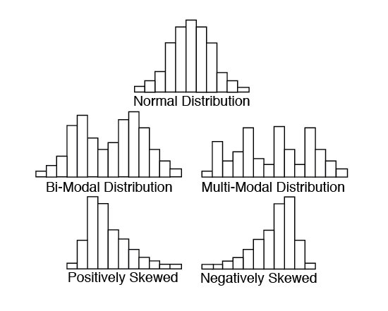
c) Shape. What is the shape? Does it look like a normal, bell-shaped distribution? Is it positively or negatively skewed (that is, more data values to the left or to the right)? Are there twin (bi-modal) or multiple peaks?
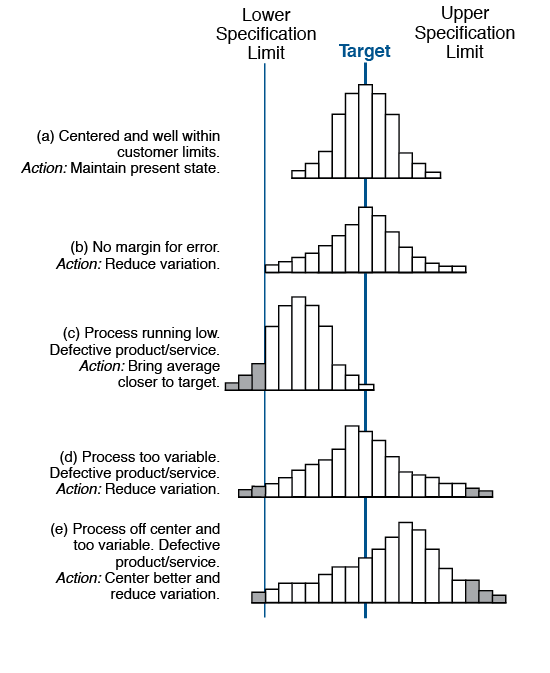
d) Process Capability. Compare the results of your Histogram to your customer requirements or specifications. Is your process capable of meeting the requirements (i.e., is the Histogram centered on the target and within the specification limits)?
Variations
Stem & Leaf Plot
This plot is a cross between a frequency distribution and a Histogram. It exhibits the shape of a Histogram, but preserves the original data values—one of its key benefits! Data is easily recorded by writing the trailing digits in the appropriate row of leading digits.
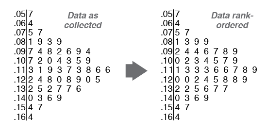
In this example, the smallest value is .057 and the largest value is .164. Using such a plot, it is easy to find the median and range of the data.
- Median = middle data value (or average of the two middle values) when the data is ranked from smallest to largest.
For this example, there are 52 data points. Therefore, the average of the 26th and 27th value will give the median value.
Median = (.113 + .116)/2 = .1145
- Range = Highest value – lowest value = .164 – .057 = .107
